Read the units without mixing them
Lumens describe light output. Kelvin describes the appearance of white light, from warmer tones towards cooler ones. Watts describe electrical input. These numbers answer different questions, so a lower-wattage label does not by itself tell you whether a bulb will provide enough useful light on your reading chair.
A smart bulb's headline output may be specified at a particular white setting. Check the product details if brightness at another white tone or a saturated colour matters to you. Do not assume that a vivid blue scene will illuminate the room like the bulb's brightest white mode.
Choose a comfortable white first
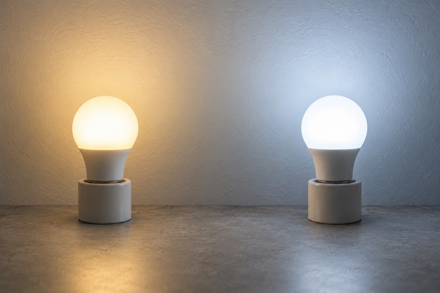
For a new lamp, begin with white light before exploring colour scenes. Put the shade in place and sit where you normally read or relax. Try a warmer and a cooler setting at comparable brightness. The one that looks attractive in a shop photograph may feel different beside your wall colour or existing ceiling light.
White-only and adjustable-white products offer different flexibility. A fixed warm-white bulb may be sufficient for a lamp used only in the evening. If the same space is used for several activities, being able to adjust the white tone may be useful. Colour capability is a separate choice and need not be part of either decision.
Avoid treating a particular Kelvin number as a universal prescription for work, sleep or health. Preferences, room surfaces and the amount of light all matter. Choose a setting that makes the actual activity comfortable rather than attaching medical promises to a lighting preset.
Test the dim end of the range
Move the brightness down slowly while looking at the task area, not directly into the bulb. The lowest setting on a slider is not necessarily a useful night-time level for every lamp. Check whether the shade creates glare or whether the light becomes too weak to see nearby obstacles clearly.
Compare adjoining lamps if they will usually run together. Two bulbs at the same percentage may not appear equally bright because their outputs, shades and positions differ. Adjust the room as a whole instead of insisting that every app slider display the same number.
Save a few purposeful settings
Create a small number of scenes with names that describe their use, such as Reading or Quiet evening. Record the settings you actually like after trying them for several days. A long list of nearly identical presets makes selection harder without adding much value.
If a routine changes the white tone automatically, check whether it overrides a manual choice later. People should be able to keep the light they need for a task. Start with predictable changes and only add more elaborate timing when the ordinary room lighting already works well.